


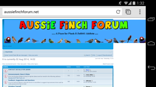
I do most of my web browsing on my mobile, on which the forum is difficult to read because the header image doesn't resize dynamically. The page content is forced into half the page making all the text tiny. See below image.
I come bearing a solution!
In the template file, replace
Code: Select all
<img src="./styles/prosilver/imageset/Site_logo.png" width="1200" height="200" alt="" title="">Code: Select all
<img src="./styles/prosilver/imageset/Site_logo.png" style="max-width: 1200px; width: 100%;" title="Aussie Finch Forum">


 If you have always insisted on the best effort and the best quality and you continue to do so, you will continue to get the best.
  That's how my and hubbys business and work ethics have always been. PS he's an electrician too.