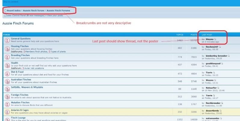


1) The breadcrumb trail is not particularly descriptive and could be much more useful. What is the difference between 'Aussie finch forum' and 'Aussie Finch Forums'? Especially as when you go to Aussie Finch Forum, all you can do is click on Aussie Finch Forums...? Similarly when down one of the thread paths it can be hard to work out how to go elsewhere without having to come back out to the main tree path. This difficulty is compounded for those on mobile devices/small screen/slow load times. Unfortunately there is a lack of uniformity so users will have to remember the quirks on each page. I'm probably not explaining this very clearly sorry. Perhaps an easy example is to find "View New Posts" you have to go all the way out to the 'Board Index' each time, regardless of what page you currently are on. It would be a very simple matter to have a 'View New Posts' link at the top of each section page or have frames with the top one static (so its always the same). The naming also leaves a bit to be desired although that is more cosmetics.
2) Seeing who posted the last comment is not really very helpful. When looking at my picture as an example, we see Wayno was the last poster in General Questions but we don't know what topic. Clicking on General Questions area might tell you which topic but Wayno may have posted on several threads/topics that day and if the page is cached, his is no longer at the top anymore. I don't know who wayno is (just using you as an example - sorry wayno) and it would be far more useful to see what the last thread was, not the poster. Again this is much harder for those on mobile devices.
Winston
sorry for image quality.... the file size restriction can be limiting.